Dec 2024: wintime95
Skills developed: Product Design, Modeling, Fabrication (Modeling, Adhesion, Physical Prototyping)
Context:
At Wharton, I balance my classes in entrepreneurship and strategy classes with hands-on product development as part of the Integrated Product Design Certificate. This program supports my engineering roots and adds a design-focused perspective to my MBA.
How to Make Things: Production Prototyping Studio (HTMT), taught by Professor Taylor Caputo, utilizes the Fabrication Lab in Tangen Hall, which opened in late 2021. The class is intended to be a curricular use of the lab. A few of my listed projects are assignments for this class.
Our final project was to design, fabricate, package, and market a small production run (15–40 units, depending on the item's complexity) for the university’s Winter Holiday Market sale. We were encouraged to use the fabrication techniques learned during our classes and materials already stocked in the lab. While objects entirely 3D-printed were prohibited, we were allowed to source functional components, such as joints and hinges, externally if the lab did not have them. Our final evaluation was based on the revenue generated from our sales.
wintime95 was our final product, and this page documents our journey from design to market.
Materializing nostalgia: Frutiger Aero
As digitization transforms everyday activities, nostalgia for the early internet has resurged. Retro design themes, particularly from the 1990s, evoke a shared cultural memory.
Named after Swiss typeface designer Adrian Frutiger, Frutiger Aero is a design aesthetic that style evokes bright blues and greens through skies, water, and greenery. The aesthetic reflected a hopeful vision of technology coexisting harmoniously with nature–a sentiment that feels pertinent even today.
Gift-making, quite like gift-giving, is fraught with anxiety over balancing customization with functionality, which is why we chose to design a functional object—a clock—with the evocative Frutiger Aero aesthetic.
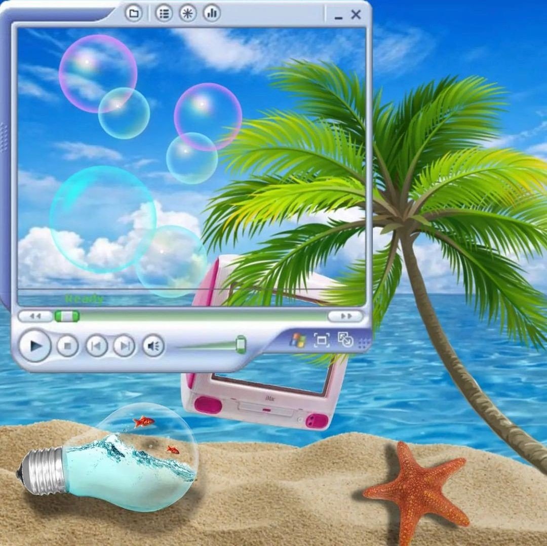
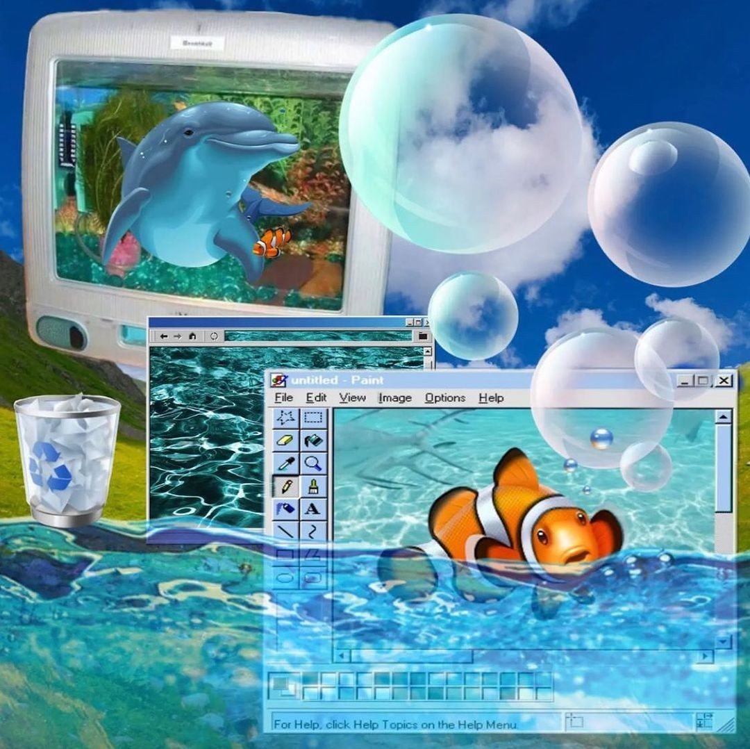
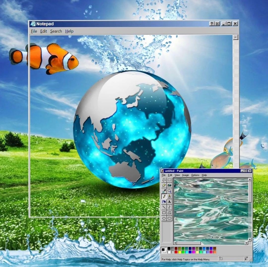

Holding in the sparkles: sealant testing
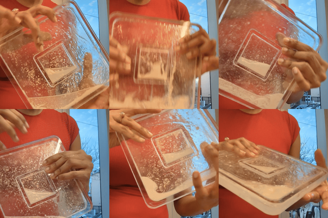
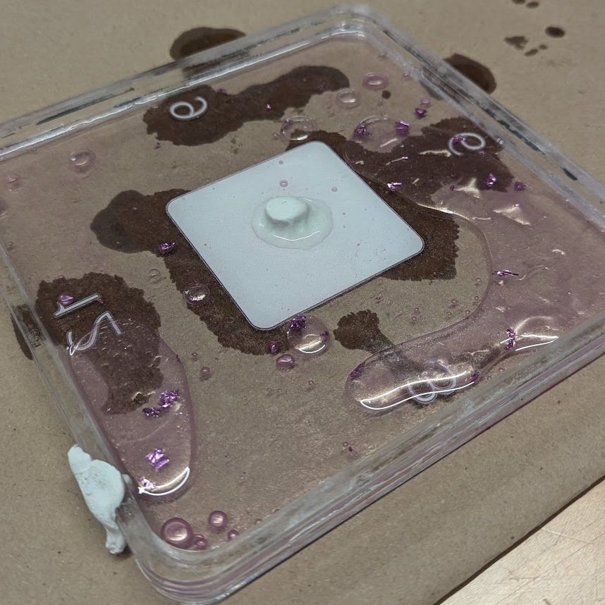
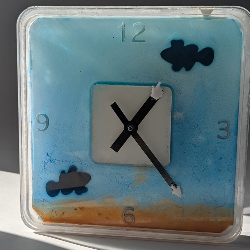
Our initial prototype was a wall clock constructed entirely in clear acrylic. We filled the inside with a solvent made of water, baby oil and soluble glitter to serve as a background for the 3D-printed fish. It was crucial for us to achieve the correct sealant, while maintaining the glass-like appearance and finish of the clear acrylic.
Every clear sealant we tested–acrylic solvent or epoxy E6000–leaked. We found that silicone caulking was a good sealant, but it was prominently visible against the clear acrylic. At this point, we decided to abandon clear acrylic.
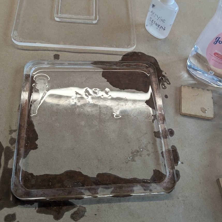
Testing the waters with different solvent mixtures
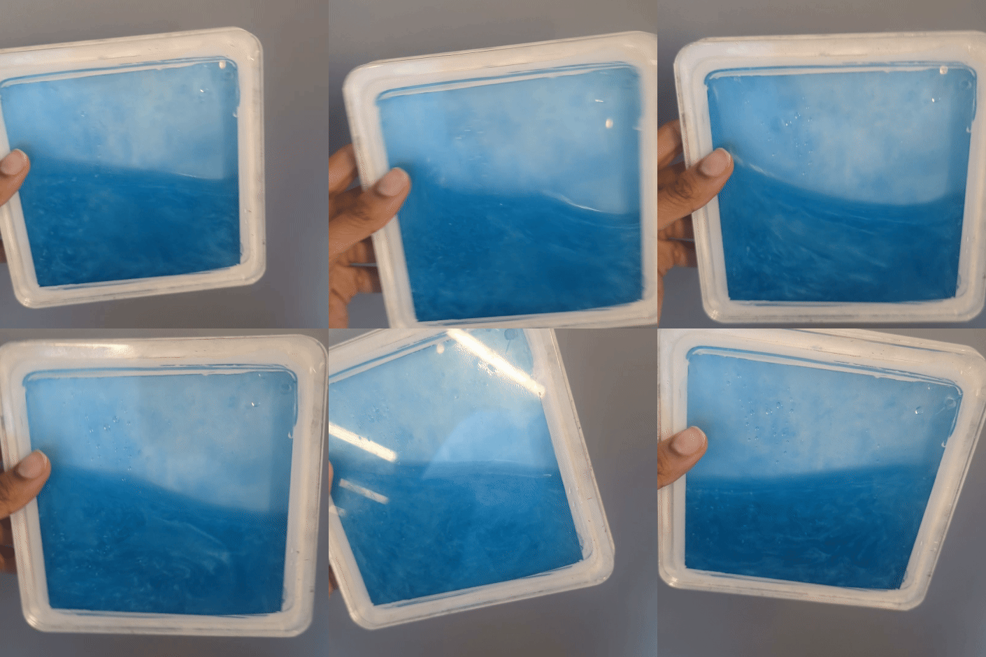
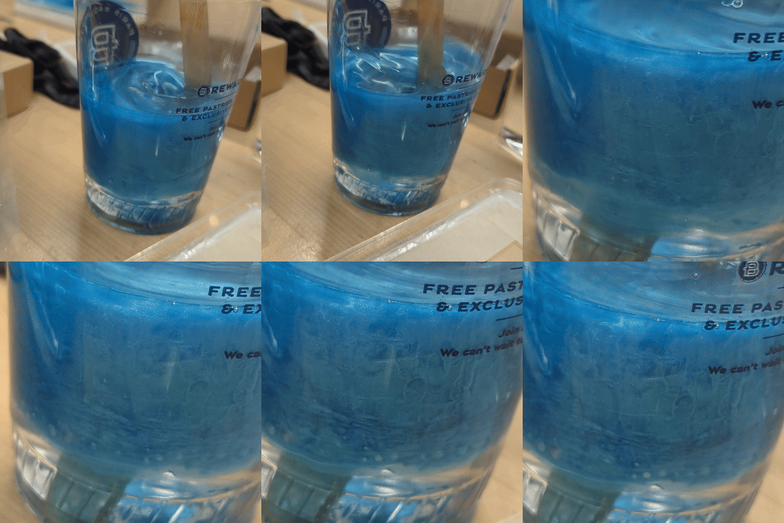
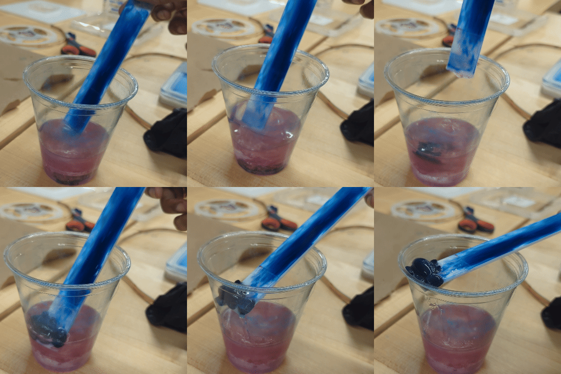
We wanted to capture the aquatic-themed graphics of Frutiger Aero by incorporating a liquid solvent. But we were worried about the solvent leaking into the clock components or the solvent density slowing the clock hands. If we added a lighting component inside the frame, that too would have to be protected from the solvent. Our initial solvent mix of baby oil and water also created another issue for our 3D-printed fish: they floated in water but stuck in the oil.
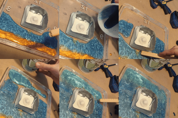
After many late nights at the lab, we pivoted to a resin blend. This took much longer to cure and solidified the fish in place, which wasn’t our initial intended effect. Even though we had a prototype that we could demo, we realized the liquid-heavy construction process was difficult to scale and maintain consistency across multiple units.
And so, we went back to the drawing board.
Re-imagining windows:
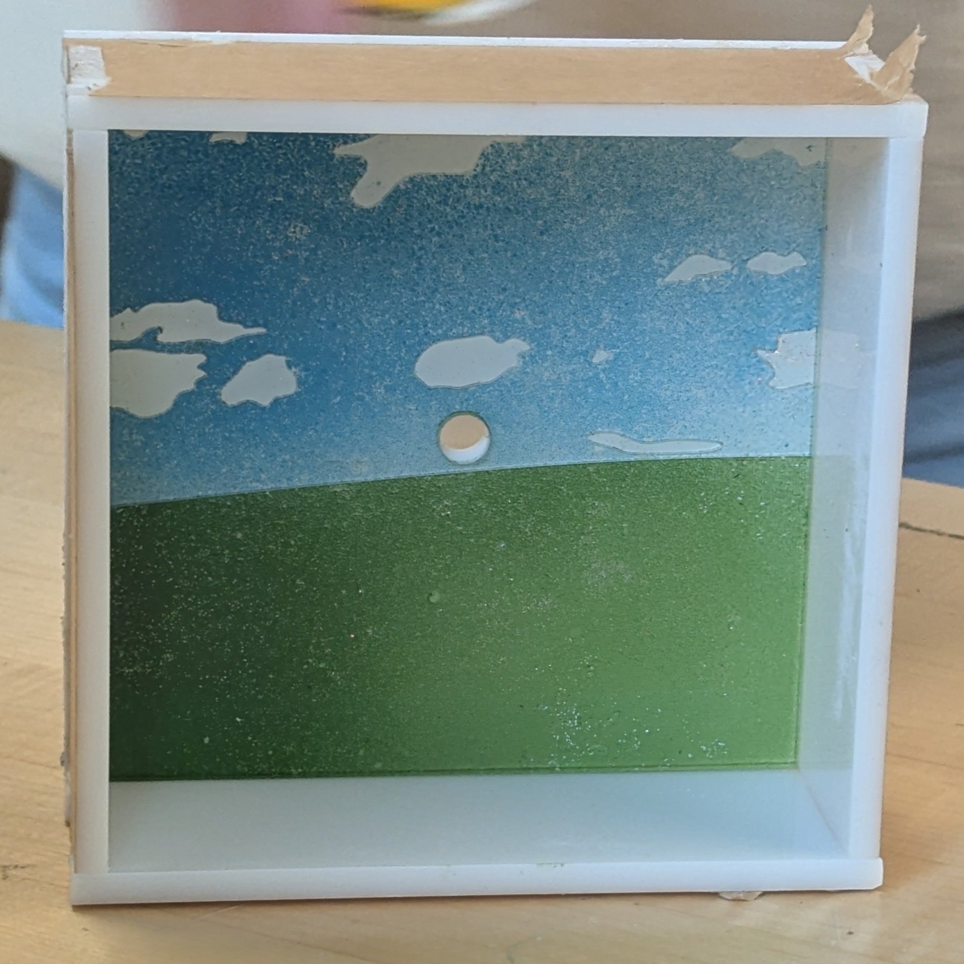
Our initial prototype received great feedback for the clock hands. This inspired us to pivot from redesigning an aquatic landscape to leveraging an established design library that successfully incorporated Frutiger Aero elements: the early MS Windows operating system.
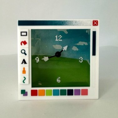
We updated the background to the iconic Windows Bliss wallpaper and adjusted the clock frame to be smaller and wider, while retaining the square edges. We wanted to evoke an era when computing devices were bulky rather than sleek.
The clock’s face mirrored an MS Paint browser window, a tribute to one of the first mainstream creative tools of the digital world. The icon set was would protrude from the frame like buttons, and the numbers on the dial were pixelated to reinforce the retro aesthetic.
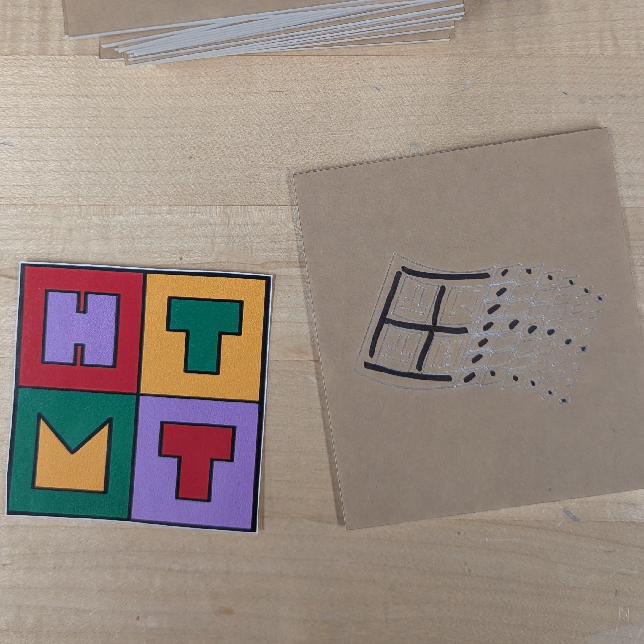
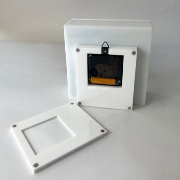
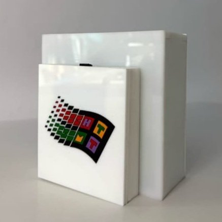
Finally, we added a “back” to the clock. While the backs of the old iMac or Compaq monitors contained electrical components integrated into the frame, ours would contain the clock mechanism. We designed a logo for our project by merging the class logo (HTMT) with the Windows 95 logo (which apparently is not copyrighted) for the back cover.
Fires, fabrication and fine-tuning:
Unlike digital innovation, where changes can be rolled out instantly, iterating on a physical product forces substantial adjustments to the production process at every stage. We lost time due to our redesign, which forced us to minimize the testing phase between iterations and final versions.
We streamlined our production run by optimizing our use of the shared laser-cutting machine in the lab. As the screenshot shows, we were down a machine (which impacted our efficiency significantly).
The time, machine and other resource constraints forced us to prune many other design features we’d envisioned for the product.
For example, we couldn’t incorporate a lighting inside the clock because we had no time to test it. We explored silicone skins (like Windows Media Player) but the materials arrived too late. For readability, we had to abandon the dialog box on the front face.
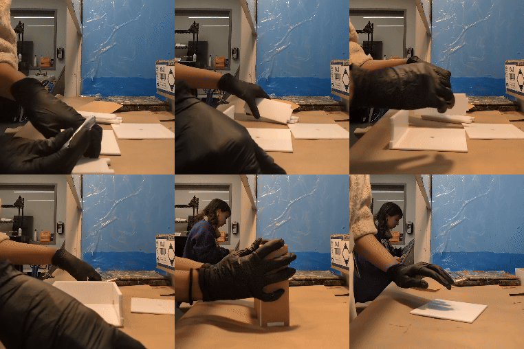
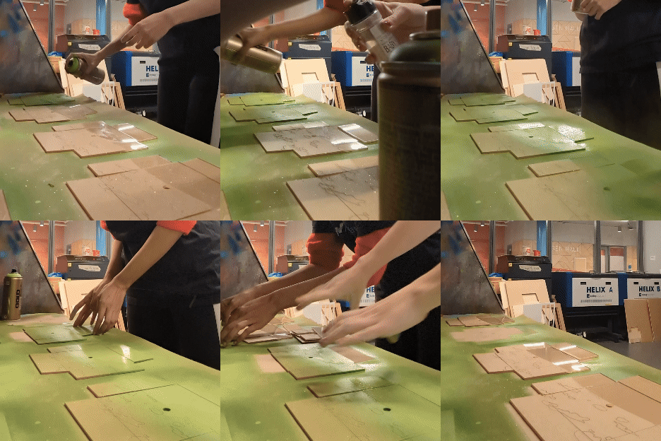
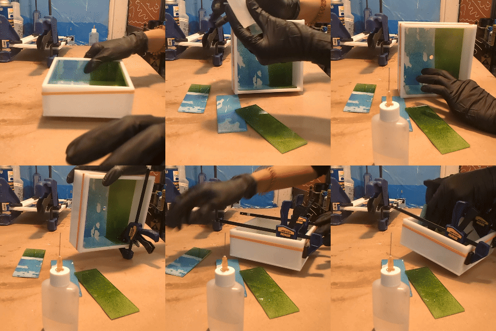
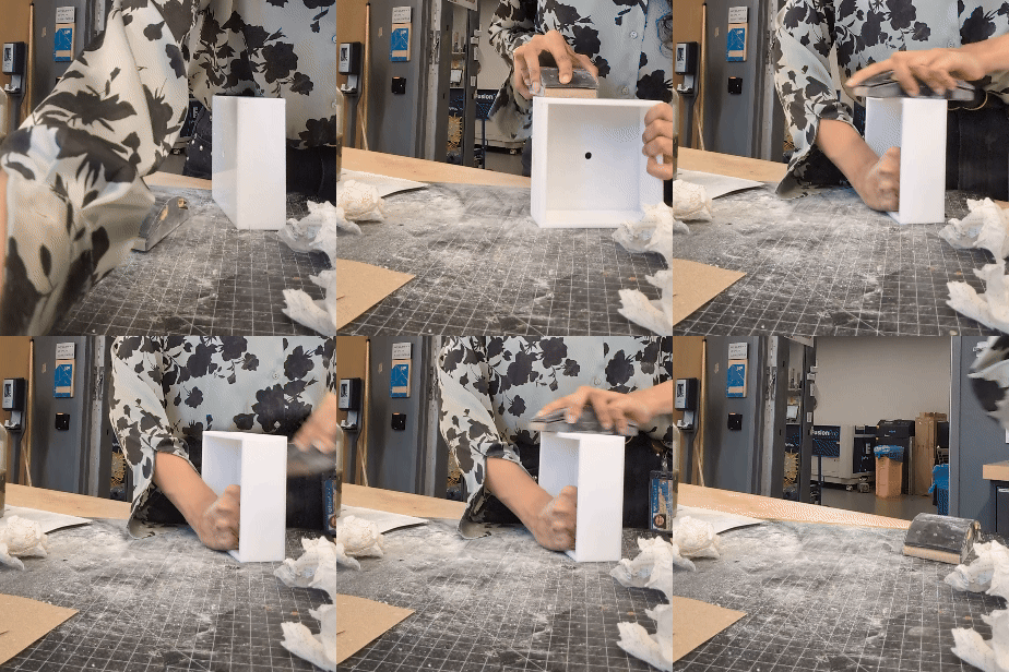
Despite batching processes to maximize efficiency–such as gluing the frame, painting the front and back, and sanding external finishes–we needed to account for repeat tasks to fix accidents and errors. Instead of the silicone skin, we focused on sanding and refining the external surfaces to achieve a smooth, polished finish.
Wrapping up pricing and packaging:
Our initial packaging design drew inspiration from Paris Baguette’s pastry boxes, which have a handle for stable carrying. I started testing on tiny prototypes to save material, but they did not scale to the size of the clock. We adjusted the design based on how customers would unbox the clocks after purchase. This allowed us to use a standard folded-in packaging box, with two holes for a carrying ribbon to support through.
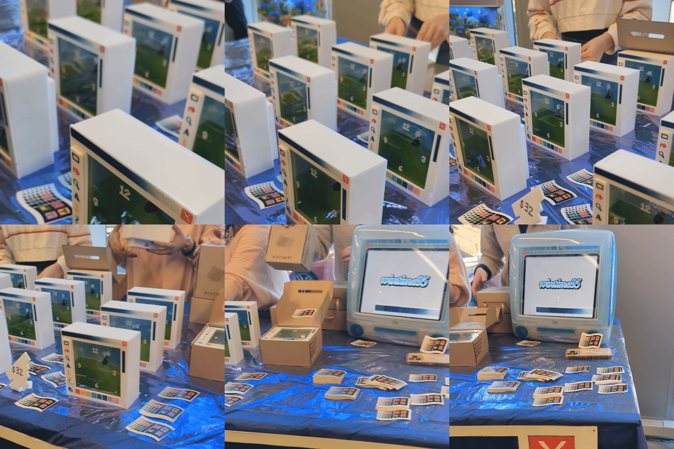
We priced the clock at $32, reflecting a narrow margin based on material costs alone. Most holiday fair customers would be college students or their parents, so we chose a price point that was accessible and balanced the product’s niche design and high execution complexity. For the final sale, we completed 16 units, each wrapped in holographic paper and sealed with our logo sticker.
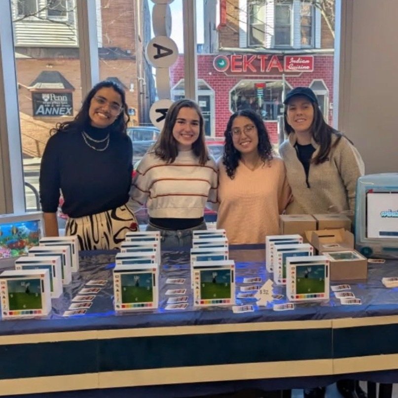
wintime95 sold out within the first half of the 3hr long holiday market. Special moments included a friend, who had closely followed the project’s progress on Instagram and wanted to make our first purchase and a parent who returned later to buy the clock as a surprise for their son, who loved the colors of our design.
Acknowledgements
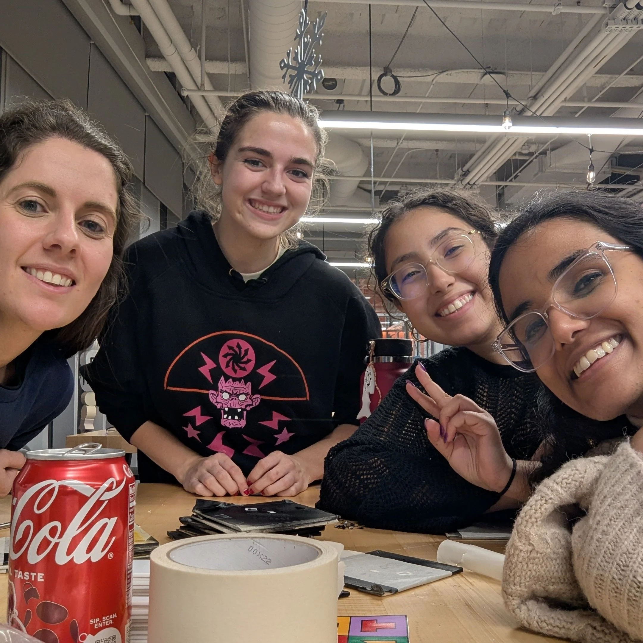
For the long hours at the lab, for the jokes we swapped over acrylic dust and for the times we protected each other from toxic fumes in the lab, thank you to my team– Djavaneh Bierwirth, Julia Gerbino and Sarah Fahmi. You are all incredible leaders and creative visionaries and I’m lucky for getting to work with you.
Thanks also to Professor Taylor Caputo for her guidance during emergencies and otherwise. Special thanks to Maansi Manchanda, Sammy Dreibelbis, Janice Noh, Carina Suba, Theo Kocher, Iryna Donska and other lab technicians of the Venture Lab. I feel lucky to share such a collaborative environment with you and for your shortcuts, feedback and wisdom. I’m sorry for the fire I caused by accident, and I’m so grateful that all of you refused to let me take the blame. Thanks also to Brian Temsamrit and Janice, especially during the stressful times.
Thanks also to all our customers, remote and in-person. Your support was invaluable in bringing this creative vision to life, and I hope you all enjoy a time-telling device that behaves as a time-traveling device.
A deep and special thanks to the McDonalds at 40th and Walnut, the Qdoba at 40th and Locust and the Paris Baguette at 39th and Chestnut. Thank you for keeping me sane during insane hours.


